Bespoke Kitchen Cabinet Painting in Historic Buckinghamshire Home

Updated: Aug 7
Some kitchens ask for a simple refresh. Others ask for a conversation with the past.
This recent renovation in a historic Buckinghamshire house sat firmly in the second camp. The property, once owned by one of Henry VIII’s wives, carries the sort of presence that cannot be copied with new beams or aged brass handles. It sits close to the Great Ouse, surrounded by a gentle, picturesque setting where the light changes through the day and the house feels rooted in the land around it.
The brief was not to make the kitchen look new for the sake of it. The aim was to revive it, soften it, and give it a more graceful rhythm without losing the character that makes the house special. The transformation centred on two bold but beautifully balanced choices: The bespoke kitchen cabinet painting using Neptune’s Cashmere for the base units, and Zoffany Musky Pink in a high gloss finish for the kitchen island and internal of the dresser.
The result is a kitchen that feels calm, elegant, and quietly memorable.
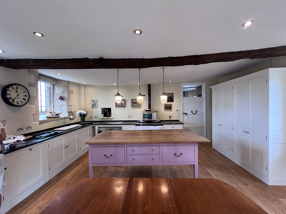
A house with history needed a careful bespoke kitchen cabinet painting finish
Renovating a kitchen in a period property is rarely straightforward. In a house linked to Tudor history, every decision carries extra weight.
The temptation with a historic home is often to lean too heavily into the past. That can leave rooms feeling staged rather than lived in. The opposite risk is just as real. A very modern kitchen can jar against old stone, uneven walls, deep window reveals, aged timber, and original proportions.
Here, the design had to sit between those two extremes. It needed to serve modern life while respecting the atmosphere of the building.

The house’s connection to one of Henry VIII’s wives gave the project a particular sense of responsibility. No kitchen renovation can recreate Tudor domestic life, nor should it try. The better approach was to respond to the fabric of the home: its scale, its light, its texture, and its setting beside the Great Ouse.
That setting became part of the design language. The river brings a softness to the surrounding landscape, and the kitchen now reflects that quality. Rather than hard contrast or stark monochrome, the palette moves through warm neutrals, muted pink, reflective gloss, and natural materials.
Our bespoke kitchen cabinet painting leaves the finished room feeling as though it belongs to the present owner, but it also respects all the lives that came before.
Neptune’s Cashmere gave the base units a softer foundation
The base units formed the visual groundwork of the kitchen. Before renovation, they had good bones, but the finish no longer brought out the best in the space. In a historic kitchen, lower cabinetry can easily feel heavy, especially where ceilings are lower or walls are irregular.
Choosing Neptune’s Cashmere changed the balance of the room.
Cashmere is one of those shades that works because it does not shout. It sits somewhere between warm grey, soft stone, and understated taupe. In changing daylight, it can feel slightly cooler in the morning and warmer by late afternoon. That made it a strong choice for a riverside house, where natural light plays such a large role.

The colour helped the base units do three important things:
Settle the room
The cabinetry now feels anchored without making the kitchen feel dark.
Respect the age of the property
Cashmere has enough warmth to sit comfortably with older architectural details.
Let the island take focus
The softer base tone gives the Musky Pink room to shine.
This was not a dramatic transformation in the loud sense. It was more refined than that. The base units now support the room, rather than competing with it.
That restraint matters. In a house with centuries of character, the best design choices often know when to step back.
Zoffany Musky Pink turned the island and dresser into the heart of the room
If the Cashmere base units created calm, the island and dresser brought personality.
The decision to use Zoffany Musky Pink in a high gloss finish was the defining moment of the renovation. Pink in a period kitchen can sound risky, especially in a house with such a strong historic identity. Yet Musky Pink is not sugary or timid. It has a grounded, grown-up quality, with enough depth to feel elegant rather than decorative.
On the kitchen island, the colour becomes a natural gathering point. It draws the eye as soon as someone enters the room, but it does not overwhelm the space. The high gloss finish adds another layer. It catches light from the windows and gives a soft reflective lift to the centre of the kitchen.

That gloss was particularly effective because of the setting. Near the Great Ouse, the light can feel bright and clear on some days, muted and silvery on others. The island responds to those changes. It feels different at breakfast, when the room is waking up, than it does in the evening, when lamps and low light reflect gently from the surface.
The Internals of the dresser carries the same finish, which gives the room a sense of intention. Rather than treating the island as a one-off feature, the matching dresser repeats the colour in a more vertical form. That creates rhythm across the room.
The island and dresser now act almost like painted furniture, not just fitted kitchen elements. In a period home, that distinction matters. Freestanding and furniture-like pieces often feel more natural than wall-to-wall uniform cabinetry.
Why the high gloss finish works in a heritage setting
High gloss can be difficult in older houses. Used without care, it may feel too sharp or too contemporary. In this kitchen, it works because the colour itself is soft and historically sympathetic.
Musky Pink brings warmth, while the gloss brings light.
That pairing stops the finish from feeling cold. The surrounding details also help. Traditional proportions, classic joinery, heritage colours, and natural textures all keep the design rooted. The gloss then becomes a modern layer, not a competing statement.
It also has a practical role. A gloss finish on focal furniture can lift a room that might otherwise absorb too much light. Historic kitchens often have deep window reveals or thick walls, which create shadow. The reflective finish helps counter that while still looking luxurious.
The key was balance. Only the island and dresser received the high gloss Musky Pink treatment. Because the base units stayed calm in Cashmere, the room avoids visual noise.
The design choices were shaped by place, not trend
The most successful bespoke kitchen cabinet painting renovations respond to their surroundings. This kitchen renovation did exactly that.
The house’s position beside the Great Ouse gave the room a natural reference point. The river, the garden, and the changing Buckinghamshire skies called for colours with depth rather than flatness. Cashmere and Musky Pink both shift subtly through the day, which makes them feel alive in the space.
The palette also works with the house’s architecture. A very crisp white could have made the older walls and surfaces look tired by contrast. A dark green or navy might have looked handsome, but it could have weighed the room down. Cashmere offered quiet support, while Musky Pink added warmth and individuality.
Several design choices helped the room feel coherent:
A restrained base palette kept the lower half of the kitchen calm.
The island became the main colour feature without dominating the whole room.
The dresser repeated the pink finish but just internally, so the colour felt deliberate yet slightly cheeky!
The high gloss finish brought light and polish to a historic space.
Traditional detailing prevented the scheme from feeling too modern.
The finished look is neither rustic nor overly formal. It feels lived in, but considered. That is a difficult balance to achieve, especially in a house with such a strong identity.

The main renovation challenges came from the age of the house
In a newer property, kitchen design often starts with square walls, level floors, and predictable services. Historic houses rarely offer that luxury.
This Buckinghamshire home brought the sort of challenges that period renovations tend to reveal once work begins. These were not problems to erase. They were conditions to work with.
Uneven surfaces needed patience
Older walls and floors can move subtly over time. Cabinets may need careful adjustment so they look level without fighting the room. A perfectly straight kitchen forced into an imperfect room can look oddly uncomfortable.
The solution was to work with the building’s character. Where needed, finishes and alignments had to be handled with care, so the cabinetry looked refined without pretending the house was newly built.
Light changed the colours throughout the day
Paint selection in a showroom is never the same as paint selection in a historic riverside home. Cashmere and Musky Pink both needed to be judged in the actual kitchen, with its natural light, shadows, and surrounding materials.
The high gloss finish made this even more important. Gloss reflects its environment, so the colour can appear richer, paler, or warmer depending on the hour. Testing and patience were essential.
The history of the house limited heavy-handed choices
A property once connected to a wife of Henry VIII carries a sense of story. That does not mean every feature must look Tudor, but it does mean careless choices would stand out quickly.
The renovation had to protect the feeling of age while still giving the room practical comfort. The design avoided harsh contrast, oversized modern statements, and finishes that would fight the architecture.
Practical function still mattered
A beautiful kitchen still has to work. The island needed to serve daily life, not just look good in photographs. The dresser needed to provide useful storage and display space. The base units needed to feel refreshed, durable, and easy to live with.
This is where the scheme succeeds. It brings visual charm, but it does not forget the ordinary rituals of cooking, hosting, and gathering.
The new ambiance is warmer, lighter, and more welcoming
The biggest change is not only in the colours. It is in how the kitchen now feels.
Before the bespoke kitchen cabinet painting renovation, the room may have had character, but it needed more lift and cohesion. Now, the base units in Neptune’s Cashmere create a soft envelope around the space. The in Zoffany Musky Pink add energy, reflection, and a sense of occasion.
The kitchen has become a room people want to spend time in, not simply pass through. It feels comfortable for morning coffee, practical for family meals, and elegant enough for entertaining. The gloss finish gives the island a polished presence, while the muted tones keep everything grounded.
There is also a pleasing connection between the interior and exterior. The river setting no longer feels like something outside the windows only. The kitchen now shares that same calm, shifting quality. The colours respond to daylight. The reflective surfaces echo the movement of water in a subtle way. The room feels tied to its place.
That is the true success of the renovation. It does not treat the house as a backdrop. It listens to it.
Lessons from this historic Buckinghamshire kitchen renovation
This project offers useful ideas for anyone renovating a period kitchen, even in a much less famous house.
Let the building guide the palette. Historic rooms often suit colours with warmth, softness, and movement. Paints that shift with the light can feel more natural than flat, stark shades.
Use bold colour with discipline. Musky Pink works here because it has a clear role. It belongs to the island and dresser, while the rest of the cabinetry stays calmer.
Mix heritage character with present-day finishes. A high gloss finish might sound modern, but when paired with the right colour and joinery, it can bring life to an older room.
Respect imperfections. Uneven walls, changing light, and old proportions are part of the charm. Good design works with them rather than hiding every trace.
Think about ambiance, not just appearance. The best kitchens support daily life. They change the way a home feels in the morning, at mealtimes, and when people gather.
This Historic Buckinghamshire Bespoke Kitchen Cabinet Painting Renovation Neptune Cashmere and Zoffany Musky Pink Transformation shows how powerful a sensitive refresh can be. The room now feels lighter, warmer, and more connected to its setting beside the Great Ouse. It honours the history of a remarkable house while giving the kitchen a confident new chapter.


Comments